As in all Fairy Tales, adapt or die.

I went to see Hanna this weekend and left the theater amazed.  I had hoped from seeing the preview that it would be based on fairy tales, and I was not disappointed.  But, we’re not talking the Disney-sequins-dressed-princess-and-charming-prince-type fairy tales; we’re talking difficult-lessons-learned-through-failure-Grimm Brothers’-gritty fairy tales.  A fairy tale with real heart.  The best kind.

The daughter without a mother.

The entire story seems based on an amalgam of the Grimm Brothers’ stories: Snow White, Hansel and Gretel, and Little Red Riding Hood, to name a few.  The daughter without a mother.  The single father raising her.  The wicked queen and her loyal, devious, but ultimately useless oafs.  The cabin in the woods.  The fortress that must be escaped.

The father, raising his daughter alone.

And of course, the final climactic scene between innocent good and jaded evil.  In this case, at an amusement park, that leaves it all out there, nothing hidden.

The evil queen of the CIA.

The evil queen and her henchman.

The amusement park, known in the movie as Grimm’s Amusement Park, could not make this movie’s references to fairy tales any more obvious.  Hanna’s mission is to get to Grimm’s house.  It is a fairy tale that takes place in an amusement park whose theme is fairy tales.  The park, in reality, is called Spree Park, and it is in East Berlin, Germany.  It was deserted in 1999 and, as explained on Focus Features’ website, it was chosen by the director, Joe Wright and the production designer, Sarah Greenwood to be the surreal and haunted location of the major scene in the film.

At Grimm's Amusement Park in the mouth of the Big Bad Wolf.

Once we arrive at Grimm’s Park, forget any subtle allegory.  The evil queen emerges from the wolf’s mouth.  She’s evil, and fair Hanna is good.  Who will adapt and who will die?

Also, it is coincidence that Cate Blanchett’s character, the devilish CIA agent, wears Prada shoes?  Brilliant!

Advertisement

1 Comment

Filed under In the Cinema

Upstaged By Design is now on Facebook

Now, you can follow Upstaged by Design on Facebook too!  You’ll be notified when I’ve published a new post and when I comment on design and decorative arts I’ve seen on screen.

Become a fan by liking Upstaged By Design on Facebook!  Thanks for all your support.

Leave a comment

Filed under News

The Dragon Tattoo and Swedish Wallpaper

When this film started, I had no way of knowing how much I would get wrapped up in it!  (I had a similar experience with the book too.)  The story is excellent, the acting is amazing, but it was the interesting British and Swedish decorative arts and parallels to Alfred Hitchcock’s Vertigo (one of my favorite things to talk about) that made me into a full-on fanatic about this movie.

First, let’s start with the decorative arts.  This movie is filled with design.  (Oh, and I just want to say that I’m not going to spoil anything …the story is too good for me to deprive anyone of that suspense!)  The story revolves around a wealthy Swedish family, the Vangers, so of course they live in some fabulous buildings.  The family’s main home, is so grand and austere, you would think they were royalty.

Erstaviks castle in Nacka Municipality, Sweden, that played the part of the Vanger family home.

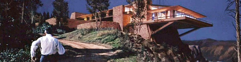
When we are introduced to the Vanger son’s home we get a glimpse of modern design.  Martin Vanger’s home was supposed to have been built in 1979, and is unlike any other space we visit in the movie.

Martin Vanger's house

The plot centers around a journalist who is brought in to investigate a long unsolved the murder of one of the Vanger children, Harriet Vanger.  His investigation begins as he is hired by the patriarch of the family, Henrik Vanger.  Henrik received a framed pressed flower every year for his birthday, just as Harriet had given him, every year, when she was alive.

Every year for his birthday, Henrik receives a pressed flower in a frame. Uhh ...he's pretty old.

While researching the family and unsolved crime, the journalist, Mikael Blomqkist, stays on the family estate in a small cabin, down the road from Martin Vanger.  It is here that we see some historic designs.  The wallpaper in this cabin is by the Swedish (born Austrian) architect and designer, named Josef Frank (1885-1967).  Frank’s work in architecture, and especially in furniture, textile and wallpaper design had a profound impact on the Swedish Style of the mid 20th century.  But this so-called Swedish style did not begin with Frank.  It  began around the time of his birth in the 1880s with William Morris (1834-1896) in England. As William Morris shaped the public taste of Victorian England, he influenced a movement that was spreading across all of Europe.  The Arts and Crafts Movement stressed the importance of handmade craftsmanship and an appreciation for nature.  (To sum up the movement in far too few words!)  These beliefs can be clearly scene in his wallpaper.  Creating in the traditional style, William Morris’ wallpapers were made from vegetable dyes and used the hand woodblock technique.

William Morris' "Daisy" wallpaper, 1864

William Morris and the British Arts and Crafts Movement directly influenced the Swedish painter and interior designer, Carl Larsson (1853-1919).  He, in following Morris (he was 20 years Morris’ junior), created an artistic house.  Larsson and his wife, Karin, filled their home with their artistic touches.  Where previously only the “fine arts,” painting and sculpture, would have been used to decorate a house, they painted and decorated walls, furniture and textiles.  The Larssons also documented their entire house in the book, Ett hem, published in 1899.  Their use of Swedish folklore and their belief in the beauty of nature can be seen in every print Larsson put into the book.

"In the Corner" by Carl Larsson, 1894 and published in Ett hem, this is a view of the drawing room. Notice the hand painted stove to the right. It is covered in botanical prints, similar to Morris' "Daisy" pattern wallpaper. (This artwork is now at The National Museum Sweden.)

With the publishing of this book, and the introduction of his style and views on home life to the Swedish people, Larsson helped to create a modern Swedish style.  (I do also need to point out Larsson’s debt to the English illustrator Kate Greenaway and her depiction of English childhood surrounded by Queen Anne architecture.)

Here is another view of the stove in the drawing room, with painter, carpenter and Carl Larsson himself in the mirror.

Okay, okay, back to the movie!!  So, with that brief history of Morris and Larsson in mind, imagine my excitement, when Blomkvist walks into his cabin and we see a view of the paper covering the walls.

Josef Frank wallpaper in Blomkvist's cabin

Josef Frank would have been familiar with Larsson and Morris’ work.  And as a last generation of the Arts and Crafts Movement, he held on to the love of brightly colored, stylized natural motifs and it shines here brightly in his botanical print wallpaper with a print called Vårklockor.

Josef Frank's wallpaper pattern, Vårklockor, from the 1940s. It was manufactured by the Norrköping Wallpaper Factory.

This is such an interesting choice to me.    In reconciling the design against the movie’s plot, it is curious that the wallpaper put up in a Vanger cabin was designed by Josef Frank, a man of Jewish descent.  (Part of the story behind the Vanger family is its involvement with the Nazi party …and I’ll leave it at that.  Like I said, I don’t want any spoilers!)

Another view of Blomkvist's cabin, with Josef Frank's wallpaper.

There is another scene in which we see this wallpaper, but this time it has a dark background.  Also, the bench in this scene caught my eye.

Once again we see Frank's Vårklockor pattern, along side an Eastlake style bench.

Up close, as seen below, the wallpaper is very vibrant.  But,  I like the aged look it has in the film.  Still, the pattern is distinct, and it is certainly Josef Frank’s design.

Josef Frank's Vårklockor pattern wallpaper with a black background.

The bench, in the picture above, where Lisbeth Salander is seated, will again take us back to England.  And, I can’t imagine how I made it this far into my story without mentioning Lisbeth!  She is a fantastic heroine, and I think one of my favorites.  Curiously enough, one of Carl Larsson’s daughters was named Lisbeth, and is featured in the prints of Ett hem.  ( I love little coincidences like that.)  I can’t say for certain whether the bench is Swedish or English, but it definitely finds its provenance in England.  As part of the firm, Morris, Marshall, Faulkner & Co., designer and architect, Philip Webb (1831-1915), created the Morris Adjustable Chair in 1866.

The "Morris Adjustable Chair" from Morris, Marshall, Faulkner & Co., by Philip Webb, 1866.

Notice the similarity in the chair rail, arms and legs of the Morris Adjustable Chair to the bench Lisbeth sits on …and yet there are differences.  The bench takes its slimmer silhouette from the Firm’s Sussex line.

The Firm's Sussex chair line, designed 1865.

Yet, that still doesn’t quite cover it.  I think the bench we see in the movie was very much influenced by Charles Eastlake (1836-1906).  And his influence too would have been felt by Carl Larsson.  Eastlake, an English architect and designer was William Morris’ contemporary.  His book, Hints on Household Taste, published in Great Britain in 1868, presented the idea that the decor of a home should have a continuity in style.  His ideas not only help spread the word of the Arts and Crafts Movement, but it would have influenced Larsson in the decorating of his family home too.

This is an American example of the Charles Eastlake style, and I think a very close look-alike to the bench in the film. (Circa 1880 from D. Dexter's Sons, it is now a part of the Brooklyn Museum's collection.)

Finally, the parallels to Alfred Hitchcock’s Vertigo gave me chills!  Not in a, “oh I’ve already seen this but it’s still great” kind of way, but in a way where new life was brought into a mystery and love story so dark, it chills you to your core beliefs.  Henrik Vanger bears a resemblance to Jimmy Stewart’s main character in Vertigo, Scottie Ferguson.  And just like Scottie, Henrik finds himself so entranced with a dead woman, his niece, that he has put his life on hold trying to find her and bring her back to life.  It is the botanical prints that he loved so dearly as a gift from Harriet that now haunt him on a yearly basis …and also offers the production designers of this movie a brilliant reason to incorporate such historically charged botanical wallpaper into the set design.

There is a necklace that plays a role in the story of The Girl with the Dragon Tattoo, and while it is not as central to the story as the necklace in Vertigo is, it is still a game changer.  The necklace Cecelia (Henrik’s niece) is wearing at one point is the same necklace that Harriet is wearing in a photograph, this brings back Michael’s memory, just as Carlotta’s necklace brings back Scottie’s.  Michael is reminded of his childhood, when his nanny was the same Harriet Vanger that he is now searching for, and two women’s identities are woven together into one.

Sources:

The Arts & Crafts Companion, Pamela Todd, Bulfinch Press, 2004

Carl and Karin Larsson: Creators of the Swedish Style, Michael Snodin and Elisabet Stavenow-Hidemark, Bulfinch Press, 1997

2 Comments

Filed under Foreign Film, In the Cinema, Modern Film

2011 Academy Awards – Art Direction

In one week, The Academy Awards will be airing on ABC.  Over the course of the evening,  fashions will be discussed and awards for acting will be handed out, but my favorite part will be finding out who will win for Art Direction.  The following are the 2011 nominees for that Oscar.

Alice in Wonderland
My first thought is that this is an odd choice, as I would have thought most of the sets were added in digitally.  But, that poses an interesting question, because whether the set is real or digital, someone still has to decide how it looks.  If a Queen Anne chair or Regency bench is chosen from an antique store or recreated in a virtual world, the designer still has to recognize the necessity of it and know where to place it.

Tim Burton's Alice in Wonderland as created by Robert Stromberg, Production Design and Karen O'Hara, Set Decoration

Harry Potter and the Deathly Hallows Part I
I’m not even sure I can choose one image to represent the Harry Potter series’ interiors.  I don’t know what I love more, Dumbledore’s office, the Griffindor Common Room, or the Weasley’s house, The Burrow.  What I do know is that there should be a religion named after Stuart Craig.  He has been nominated for his work in Harry Potter since the first movie.

...well, have you guessed my favorite? David Yates' (and J.K. Rowling's) The Burrow, as created by Stuart Craig, Production Designer and Stephenie McMillan, Set Decorator

Inception
If you happen to have read my post called, The Architects of Simplicity, then you’ll know who I want to win in this category.  Magnificent sets.  Both real and virtual.

Christopher Nolan's dream world of Inception as created by Guy Hendrix Dyas, Production Design and Set Decoration by Larry Dias and Doug Mowat (Photo by Melissa Moseley)

The King’s Speech
This is a movie I will look at more closely in a forthcoming post.  The royal palaces had to be historically accurate and the background often blended out of focus as the attention was placed, rightly so, on Colin Firth as King George VI and Geoffrey Rush as Lionel Logue.  All this was done with impressive ease.

Tom Hooper's The King's Speech, as created by Eve Stewart, Production Design and Judy Farr, Set Decoration

True Grit
I must confess, this is the final box to tick on my “Oscar movies to see list” and I’ll be seeing it this week!  But, while a lot of this movie appears to take place outside, if Joel and Ethan Coen’s past movies are any indication, their sets always have as much personality as their characters.  I will hopefully have more details to report soon, full of great Western Frontier interiors!

The Coen brothers' True Grit as imagined by Jess Gonchor, Production Design and Nancy Haigh, Set Decoration

I’ll be watching (and tweeting the results!) next Sunday, February 27.

Leave a comment

Filed under Modern Film

Upstaged by Design is now on Twitter

Now, you can follow Upstaged by Design on Twitter.  You’ll be able to see when a new post is up and I can tweet quick notes on historic design in movies.

Follow me by subscribing to “upstagingdesign” on Twitter!

Leave a comment

Filed under News

Dream Room, Age 8.

Here’s a fun one: gummy bears.  It’s weird how much they’ve been popping up in my life lately.  I originally saw the chandelier below on a design blog, called Likecool, this past March.  Then in August, I saw stills from Nickelodeon’s TV show, iCarly, of the main character’s bedroom and knew I wanted to write about it.  In September, a friend sent me a link on giant gummy bears.  I’ve since seen a commercial on TV for adult gummy vitamins.  And finally, it culminated in a nostalgic discussion of the cartoon Gummi Bears and their Gummi Berry Juice with my co-workers.  It’s funny how life works like that, as soon as you become aware of something, you see it everywhere.

Gummy Bear Chandelier, Designed and made by Kevin Champeny, Acrylic, Edition of ten, For sale at Jellio.com

Anyway, back to design.  What is it about gummy bears?  I’ve always liked them, and clearly, I’m not alone.  I had a bracelet made up of acrylic gummy bears growing up.  They’re like shiny, glowing gemstones, that are sweet and gooey.  As a child, I don’t think it could get much better than this.  And even though I was growing up in the 80s, thirty years later, they are still as popular as ever.

Gummy Bear Bracelet, available on Etsy.com

Of course, it’s not like I was the first child to have this fascination.  In the early 1970s, Willy Wonka and the Chocolate Factory (based on the 1964 book by Roald Dahl) came out in theaters and we all caught our first glimpse of a Gummy Bear tree.

Gummy Bear trees in the foreground at Willy Wonka's factory

Carly Shay’s bedroom, is every little girl’s dream room.  Colors abound, like an over-sized jewelry box, every surface in that room sparkles or twinkles.

Carly Shay's bedroom, and yes, that's a trampoline at the end of her bed. Photo Credit: Lisa Rose/Nickelodeon

While the chandelier is a known design object, as well as some of the other lamps, the rest of the set was created by a very talented and young-at-heart, art department. (Here are their credits on IMDB.com.)  With Harry Matheu as Production Designer, Jason Howard as head of Set Decoration and Art Direction by Jim Jones, they managed to create a candy palace.  A sort of Dylan’s Candy Bar as a bedroom.

Carly's wall of gummy bear lights, a shrine to gummy bears! Photo Credit: Lisa Rose/Nickelodeon

These lights, pictured above, are also available at Jellio.com and are LED, battery operated lights. The practical adult in me thinks, “oh good, so there’s no electrical cord to mess with.”  But, eight year old me thinks, “cool! so you can put them anywhere and take them with you anywhere too!”  I like the eight year old me.

Gummi Lights, also by Kevin Champeny

The plot of the episode of iCarly where the gummy bear room is revealed, “iGot a Hot Room”,  starts with Carly’s older brother making her a gummy bear lamp of his own design, for her birthday.

Carly's birthday gift from her brother, Spencer, based on her favorite candy, the gummy bear. Photo Credit: Lisa Rose/Nickelodeon

But when Spencer’s gift ends up setting her room on fire, her bedroom is re-created into the gummy bear wonderland that we see pictured.

And just in case your sweet tooth wasn't filled with a cavity yet, there's this setee that looks like an ice cream sandwich. Photo Credit: Lisa Rose/Nickelodeon

If you’re wondering how to make this room in your own house, Nate Berkus created his version on his show.

Now …who else has a craving for gummy bears?  What’s your favorite flavor?  Mine’s pineapple.

6 Comments

Filed under As Seen On TV

The Architects of Simplicity

It all begins with an architect.

Michael Caine as Leonardo DiCaprio's character's architecture professor in Inception.

Leonardo DiCaprio’s lead character in the film, Inception, used to be an architect.  But now, sometime in the near future, he’s an Extractor.  He can enter your mind through dreams and see your subconscious and thereby know your deepest secrets and inner-most thoughts.  It is up to the Architect of the dream, played by Ellen Page (Ariadne), to create the built world of the dream.

The idea of inception (and don’t worry, I’m not going to give any spoilers) is to plant the seed of an idea in a person’s subconscious, but in order for the idea to take root, it must be in the simplest form, and if the Extractor can do that, then the idea can grow, organically in the person’s mind when they awake.

From the first scene in the movie, I knew I was going to have to write about it.  That first scene takes place as Leonardo DiCaprio’s character, Cobb, is escorted into a Japanese dining room.  The first shot we see of this room includes a view of the back of a large half-circular chair with lattice work design at the head of a table, lined along the sides by a dozen or so, smaller, half-circular chairs with vertical rails.

Japanese dining room in Inception with Joseph Gordon-Levitt (Arthur), Ken Watanabe (Saito) and Leonardo DiCaprio

And just as nothing is as it seems in a dream, the same is true of this room.  While it is set in Japan, the chairs around this table are not Japanese.  In the image above the lattice work chair is not visible, but Arthur and Cobb are both seated in the side chairs. [You may need to click on the image and follow it to its original link to see the chairs more clearly.]

The lattice work style chair, whose back is to the audience in that first scene is a chair designed by Charles Rennie Mackintosh in 1903, called the Willow Chair.

Mackintosh's Willow Chair, designed in 1903 for The Willow Tea Room on Sauchiehall Street in Glasgow, Scotland.

The side chairs were designed by Frank Lloyd Wright, in 1937, for the Johnson House, called Wingspread in Racine, Wisconsin.

Wright's Barrel Chair from 1937

That these two chairs, designed by a Scot and an American, fit into a Japanese setting, is of no surprise.  Both Mackintosh and Wright were greatly influenced by Japan, its architecture and design.  The elegant simplicity and minimal decoration of Japanese design was admired and copied by both of these architects.

Even the light fixtures, both in the Japanese dining room and in the main hall (as seen in later scenes, and below) contain light fixtures that are unmistakably Japanese in style, but appear much like fixtures by Mackintosh.

Leonardo DiCaprio stands in the main hall of a Japanese house under Mackintosh style lighting fixtures.

Notice the similarities in the lighting fixtures between the Japanese house above and those in The Hill House, designed by Mackintosh in 1903, below. Gabriele Fahr-Becker, talking about another building by Mackintosh in Art Nouveau (Könemann: Germany, 1997) stated, “The Glasgow School of Art, Mackintosh’s most famous building, belongs to architecture and architects, or rather to building and the future.  This manifesto of simplicity, warding off all false pomp with its block-like, self-contained composition, has become a model for future generations of architects.” (p.53)  I like thinking of this quote in relation to the dream architect of the movie.

Interior view of the main hall with light fixtures at Mackintosh's Hill House, 1903.

The light fixtures in the library at The Glasgow School of Art, 1909, are modern interpretations of the more traditional cluster of lanterns that hang above the table in the Japanese dining room in the movie.

And since we seem to be covering all 20th century architects that were influenced by Japanese design, it only seems appropriate to include California’s Greene and Greene.

Charles and Henry Greene were also influenced by the elegance and simplicity of Japan, although their work tended to focus on the craftsmanship rather than the functionality of Mackintosh and Wright’s works.  And while I tend to think that Mackintosh and Wright looked more to the future and rejected Historicism more than Greene and Greene, all four men held true to their shared beliefs in simplicity, unity and nature.

And while dreams can combine ones ability to re-live memories of the past with wishing for the future, so did these architects.  Henry Greene was quoted in 1912 as saying, “the idea was to eliminate everything unnecessary, to make the whole as direct and simple as possible, but always with the beautiful in mind as the first goal…” (Greene & Greene Masterworks, by Bruce Smith and Alexander Vertikoff, Chronicle Books: San Francisco, 1998, p.27)

Freeman Ford House, 1909, by Greene and Greene.

It is so perfectly fitting, then, that the former Architect, Cobb, and his wife share a house outside of Los Angeles, that was built by Greene and Greene.  This house, the Freeman Ford House, is a metaphor for the beauty of simplicity in design and in the dreams of Inception.   Cobb may appreciate the house’s simplicity as a former architect, but he can also see the necessity in the simplicity of ideas.

While Pasadena is proud to claim the Freeman Ford house for it’s own, there are not many interior photos of it available online.  But it’s characteristics are similar to those in many other Greene and Greene houses.

This window, actually at the Ford House is a common design element, horizontal bands of windows with stained glass. A window like this is visible in the scenes that take place in the Cobbs' dining room.

This interior image is of Greene and Greene's most famous residential structure, the Gamble House, 1909.

The image of the Gamble House above shows the dominance of woodwork in the interior and the use of low ceilings and constricted space opening up into larger rooms and more open space.  We got to experience this every time Cobb walked down the long, narrow corridor to his dining room that looked out over a large backyard.

Another area of the movie Inception that I want to mention is the music.  I can’t talk about the musical theory behind it, but as I was watching the movie, in the theater, the soundtrack blew me away.  It was those two deep beats played by an ear-piercingly loud horn every time it was all about to go to Hell, that made me jump and stay on the edge of my seat.  I found an interesting article about how those two notes mimic the two notes played in the Edith Piaf song used to wake the dreamers, “Non, Je Ne Regrette Rien.” The music is by Hans Zimmer and it’s brilliant, not only in its ability to captivate but in the symbolism of a song about no regrets being used for a movie about continuously re-living dreams.  There’s something about the music (and this whole movie) that reminds me of Vertigo (or maybe it’s the cymbals in The Man Who Knew Too Much), which just makes me love it all the more.

One of the main characters in the movie is named Eames. Charles and Ray Eames are two designers and architects that I mention the work of often. Here is Cobb, with Eames, played by Tom Hardy, in Inception.

Here is Cobb, the former Architect, and Ariadne, played by Ellen Page, the new Architect. Every time I saw her on screen, I couldn't help but think, "note to self: wear scarves more often and study architecture in Paris."

4 Comments

Filed under In the Cinema, Music

Talk to Her …and sit in this chair.

Here’s a quick one.  After writing a previous post on Pedro Almodóvar, I decided I needed to see all his films.  My latest one is Talk to Her (Hable con ella), and just like the others before it I was intrigued, amazed, shocked and delighted.  His story telling, the look of the film and his actors are all superb.  So, it was truly an added bonus to see another famous chair in this movie.

View of Alicia's father's office.

This chair was designed by Charles and Ray Eames in 1956 for the Herman Miller furniture company.

Eames Lounge (670) and Ottoman (671), 1956

And now that I’ve noticed this chair once, I must notice it somewhere at least once a week.  It’s in movies, on TV, in print advertisements.  It even appeared in a Cole Haan ad on the side bar of my email.

Advertisement for Cole Haan featuring the Eames Lounge chair

You might also notice a famous table in the scene from Talk to Her.  It is Eileen Gray’s chromed steel side table from 1927.  Built for the E 1027 house in the South of France, these tables were likely inspired by the chromed tubular steel furniture of the Bauhaus.

Side table designed by Eileen Gray in 1927 for her E 1027 house (built between 1926 and 1929). It was originally meant to be a bedside table.

1 Comment

Filed under Double Takes, Foreign Film, Modern Film

It’s Complicated and Perfectly Cluttered

This is my first entry under the new category of “Favorite Rooms.”  This category is for all those homes I see in movies that I love and make me think, “I could live there.”   While I like to focus on historic and famous furniture design and architecture, sometimes a good room is just, well, good.  So, it’s a little selfish, but hey, why not share?  And as I started to research Meryl Streep’s character’s house in the movie It’s Complicated, the more I realized – or so I hope – that perhaps this isn’t a selfish entry at all.  A lot of other people have written about Jane’s house and how fabulous it is too.  So, if you share our sentiment, let me know.

The exterior of Jane's house

Jane, who is now divorced from Jake, still lives in the family’s house in Santa Barbara, California.  The Spanish Eclectic style of the exterior of the house is common in the Santa Barbara area, and was probably built sometime between 1915 and 1940.

The first view we see of Jane's kitchen

But, I think it’s the interior of her house that turned me into a fan.  I love that it’s cluttered and yet clean, how warm and inviting it is and how much it makes me feel at home; it’s just like how a mom’s house should look.  I like the color palette and how the background surfaces of the walls, floors, trim and furniture remain neutral in creams, whites and natural wood tones.  The color in the room, and its warmth is in the bursts of color in the seat cushions, the table runner, plants, paintings and the food.  And it’s those bursts that bring a vibrancy to the space.

Another view of Jane's kitchen

I like how even though there is something everywhere you look, it’s all organized and it feels like everything is in its place – kind of like the story line of the movie.  It’s complicated, but it’s just as it should be.  I just can’t imagine why Jane wants to have an architect come in and redo the whole thing!  (Don’t worry, if you haven’t seen the movie, I haven’t spoiled anything.)

Here are some of my fellow bloggers who are also loving this house!   Cathy Whitlock has written about the set in Traditional Home and has an amazing design blog of her own about movies called Cinema Style.  Rooms to Rave About and Design-59 also love it and Remodelista will show you how to copy the look.  Beth Rubino was the set decorator for this film as well as Nancy Meyers’ movie, Something’s Gotta Give.  Nancy Meyers also directed The Holiday, which, no joke, is going to be my next entry in this new category for me.  If there’s a little English cottage in the movie, I’m going to love it.

1 Comment

Filed under Favorite Rooms, In the Cinema

The common denominator: Jimmy Stewart

Now this is going to be tricky.  First of all, I am not a costume historian, I just like clothes and fashion history.  And secondly, I’m going to try not to gush over Alfred Hitchcock, let me just say this now: I ADORE his movies.

So, not surprisingly, I’ve watched Vertigo (my favorite movie of all time) and The Man Who Knew Too Much (the newer version, and by that I mean the 1956 version with James Stewart) multiple times.  It occurred to me during my latest viewing of The Man Who Knew Too Much, that Doris Day’s suit was awfully similar to Kim Novak’s in Vertigo.

Kim Novak in Vertigo as Judy as Madeline...

Doris Day in The Man Who Knew Too Much as Jo

I’m going to assume that this coincidence is no coincidence at all, and rather has everything to do with the fact that Alfred Hitchcock used the same costume designer in most of his movies: Edith Head.  The Man Who Knew Too Much came first in 1956 and Vertigo soon followed in 1958, and both were costumed by Ms. Head …and starred James Stewart.

I found some references to these costumes on IMDB (Internet Movie Data Base).  According to IMDB, “Edith Head and Alfred Hitchcock worked together to give Madeleine’s clothing an eerie appearance. Her trademark grey suit was chosen for its colour because they thought it seemed odd for a blonde woman to be wearing all grey.”   But, they had already given this look to Doris Day, a blonde, two years earlier.

Jo McKenna at Ambrose Chapel in her gray suit and black hat

The one difference I notice straight away is the use of a hat.  Doris Day’s character wears a black pill box hat with her gray suit and white mock turtleneck.  Kim Novak’s character’s hairstyle actually plays an important role in the movie – as she is copying the style of a woman’s hair in a portrait.  Kim Novak’s Madeline is also much more sensual and less proper than Doris Day’s Jo.

Doris Day with Alfred Hitchcock and Jimmy Stewart in the set of The Man Who Knew Too Much during her birthday

Kim Novak on the set of Vertigo with Alfred Hitchcock

So, the common denominator isn’t really Jimmy Stewart at all, but more likely, Edith Head.  She was quoted as saying, “I don’t usually get into battles, but dressing Kim Novak for her role in Alfred Hitchcock’s “Vertigo” put to the test all my training in psychology.”  I’m not sure if she’s talking about Kim Novak here or about how important the costumes were to the psychology of the movie and of the characters in the movie, I’d like to think the later.

3 Comments

Filed under Costumes, The Classics